Is 1,000,000 big or small? Good or Bad?
Famously, we can say … it depends.
A million dollars in the bank is good.
A million people infected with COVID – that’s bad. But not
as bad as the cumulative 97.4 million that have been infected to date (as of writing this article).
So, it’s clear that when we work with numbers – we need to use context.
We know that people react differently to numbers. Some feel
very comfortable with numbers, immediately grasping what they mean and can
either decern the context or build one for themselves. Others, well just stay
mystified.
Science shows that it is very hard for most of us, to truly
comprehend “big” numbers. To those we refer to as “non-data people” – without some
context – it becomes almost impossible.
We could go so far as to say that communication, in general,
without context, is difficult or even impossible - even without any “data” involved.
One word, on its own – can be so simple without context, and
so easily misunderstood.
Take the word “well”
for example.
When put into 2 sentences, it has completely different
meanings:
“Well, we did not really have the time to do that.”
“It all went really well”
Negative in the first phrase, positive in the second – clearly
the context determines how the word is to be perceived.
When it comes to Data, context is everything.
Getting back to numbers, imagine sitting in a board meeting,
without knowing anything about the meeting’s topic.
Someone says “we sold 10K units”. [We deliberately use “K” here, since not e
v e r y b o d y knows what “K” refers to].
We could think “wow!” nice sale. However, later on, when
someone else in the room asks “That is all? How come?” – only then do we
realize that 10K is not much. It will take us a bit longer to realize that in
this case – the speaker meant we sold 10 “K” units…. the units are called “K”.
Well, talk about context … 
All joking aside, we can offer our audience context not just
in the story itself, but also in helping them to understand data when it comes
in large numbers.
Let’s see some examples:
Linda recently helped her client’s presentation convey some very large numbers. With the intended impact, they were conveyed in the following way:

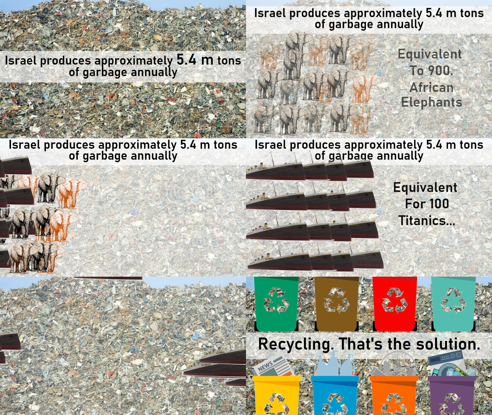
In another presentation, Jude “translated” the amount of
garbage produced in Israel in this way:

In both cases, we went for images everyone is familiar with –
to convey the size of the numbers. Conveying the size clearly also delivers the
impact the client wanted to create.
Let’s look at another example. We think the context is there
to see, but it might not be as easy for others to see it right away:

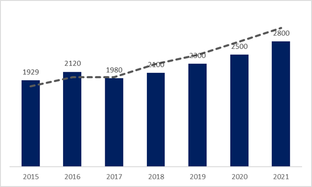
A data person, or anyone who is very familiar with the numbers and analyzing data will look at the chart and understand what’s the point (insight).
But for others, they can see that something has changed – but, why? What happened there? Is it good? Is it bad? Do we need to do something about it?
The numbers are up. “YEAH, we did well!”
If we make a small addition to the chart, let’s see what it tells us now:

Now, we can clearly see that it is not a “we did well chart”.
Instead, it is clear that 2017 was the last year we met or surpassed our Goals.
Something needs to change here!
So now that we know that the results weren’t “good” –
something has to be done or some action needs to be taken.
All we needed to do was add the legend … that simple detail gave
the chart the correct context.
This time it was a legend. Perhaps next time it could be a
more explanatory ‘title’. Maybe even a brief sentence or two that gives the
perspective from which this data should be viewed. Regardless, our point is –
consider the audience, step out of your viewpoint and look at from an
outsider’s point of view. Think about what do they need to know to fully grasp
and appreciate the message your numbers are trying to tell.

